Design approach
A few models I keep coming back to when I shape a product or service — how I judge whether a design is good, where it should go next, and who it has to work for.
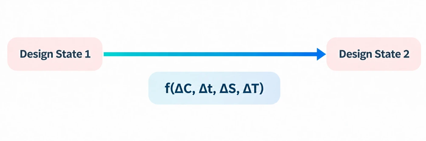
Good design is a strategy: it moves a system from one state to another — from Design State 1, the existing experience of the product or service, or its competitors, to Design State 2, the proposed one. That shift can be read as a function of four things:
- C — cognitive loadThe mental effort the system asks of a person. It’s visible on the surface (the information and the interface) or invisible underneath — the structure that decides how much thinking the surface demands.
- t — timeThe time a task takes.
- S — scopeThe room the system gives a person to act — the range, control and possibility afforded to the user.
- T — technologyThe technology used to deliver the product or service. A change here should meaningfully move C, t or S — new capability for its own sake isn’t design.
Whether these should rise or fall isn’t fixed — it depends entirely on S. A wider scope can earn more load and more time; a narrow, everyday task should shed both.
Services and products are narratives that fit into a person’s everyday life and help them be better at whatever they’re pursuing. In the end a product or service is a method of achieving a task — and the best method is when the task at hand is fun.
Borrowing from Dieter Rams, a product or service should behave like a good English butler — there when you need it, and in the background when you don’t.
Users, business, ecosystem
A successful product or service is the outcome of a balance — the interaction between users, the business, and an evolving ecosystem. In other words: desirability, feasibility and viability.
Cost and pricing live here too — what it takes to deliver the thing, set against how much value the business can create for the user.
Design lives where the three meet. Lean too far into any one and the other two start to pull the product or service apart.
Two lenses I use to find where a product or service should go next.
The Kano model
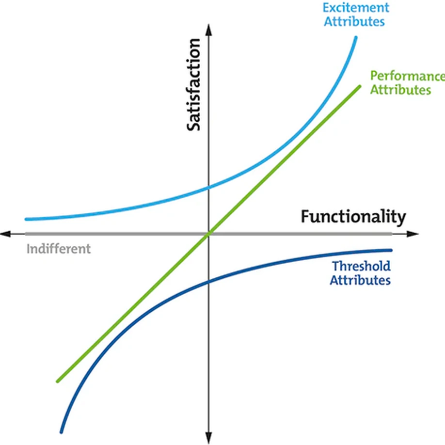
The Kano model is one of my favourite tools for working out where a product or service should go next. By looking at how people actually perceive each feature, it maps new trajectories of growth.
Some features only ever meet a threshold — expected, invisible when present, painful when missing. Some scale with performance. And a few create excitement: delight nobody asked for.
Initiation, retention, adaptation
With every use, expectation rises — for either a better experience or improved performance. That points design in three directions:
- InitiationGetting a person in and to first value — onboarding, and the first task that proves the thing is worth it.
- Retention & growthEnhancing and refining the basic and performance attributes — and introducing fresh patterns that make the experience captivating.
- AdaptationAdapting to new technologies, and to the changing needs of the user and the business.
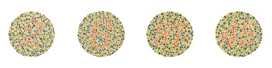
There are numbers hidden in the circles above. If you can’t make them out, that’s a colour deficiency called protanopia — it affects about 1% of men, including me.
So my UI work is inclusive of people with protanopia by default. :)