SaveIN: Making Digital Banking Feel Effortless for Everyday India
SaveIN gives Indian millennials a neo-banking app that turns everyday payments and first-time investing into fast, legible, confidence-building actions — so managing money feels less like paperwork and more like progress.
Design a neo-banking experience for Indian millennials that makes everyday payments effortless, first-time investing legible, and builds confidence at every step — delivered solo, from brand to product, within RBI and compliance constraints.
- Build a trusted digital banking experience
- Meet regulatory and compliance requirements
- Create space for new social-finance models
- Make users more aware of their net worth and encourage saving and investing
- Have a seamless banking and payments experience
- Understand financial products clearly
- Manage borrowing and repayment with minimal friction
Audited five major banking apps, then reframed the brief into two speeds — a lightweight Payment State for habitual micro-tasks and a secure Banking State for high-value decisions. Rebuilt the home page, fixed-deposit, and core flows around clear projections that nudge toward investing with trust and clarity.
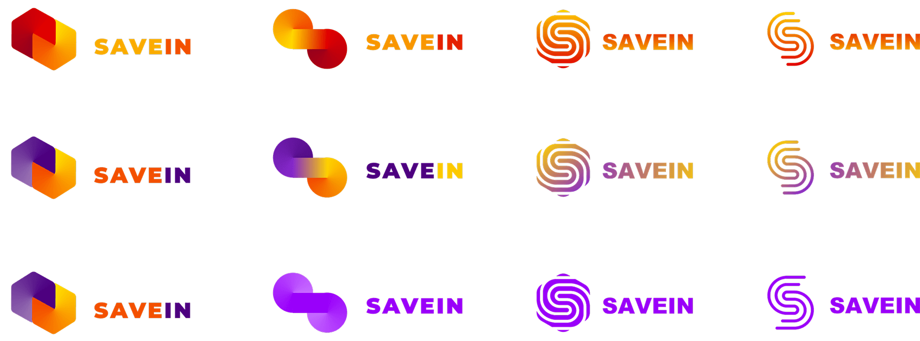
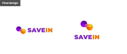
- Brand identity — logo built around the ‘S’ and infinity symbol, gradient system, and visual language
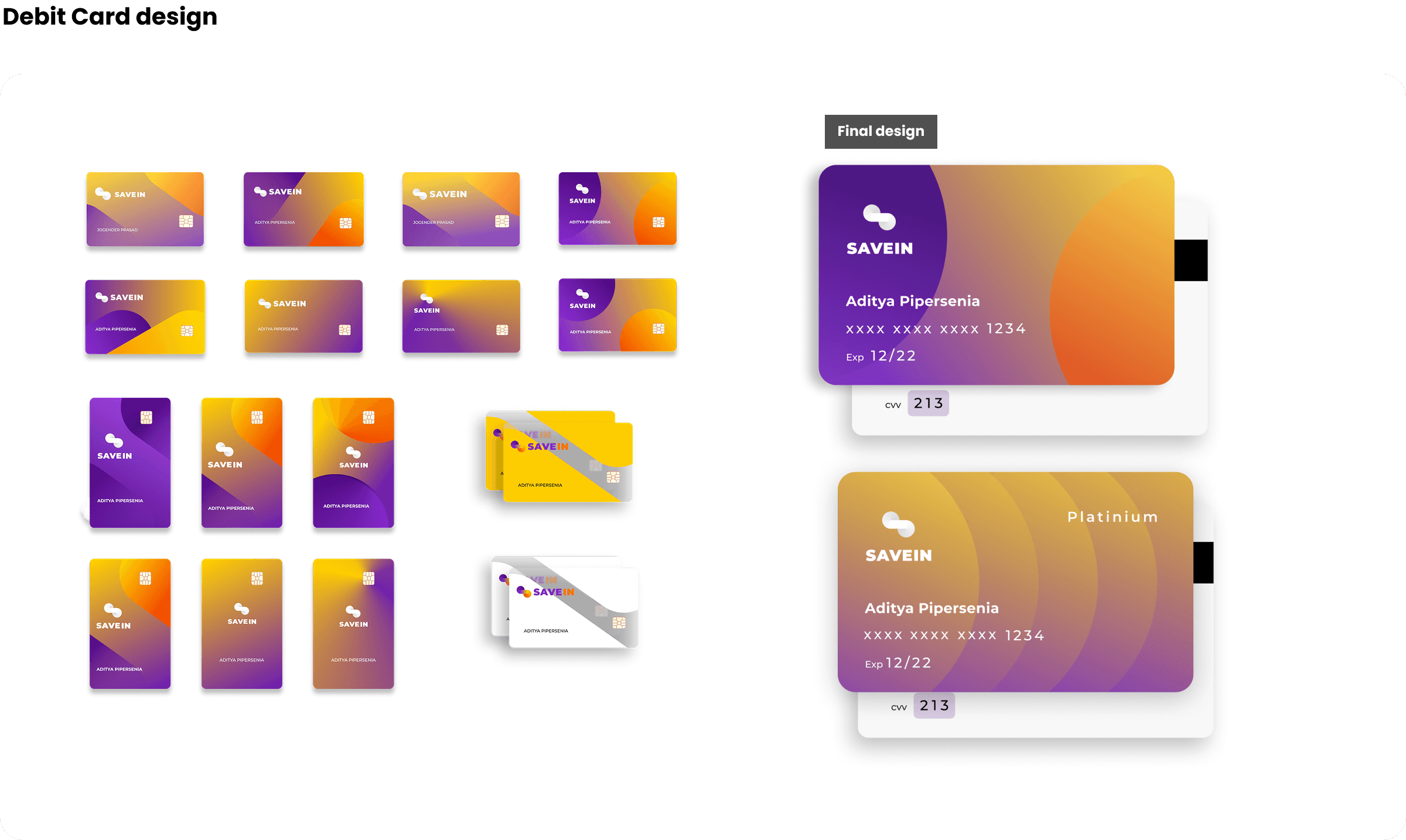
- Debit card design across the full range
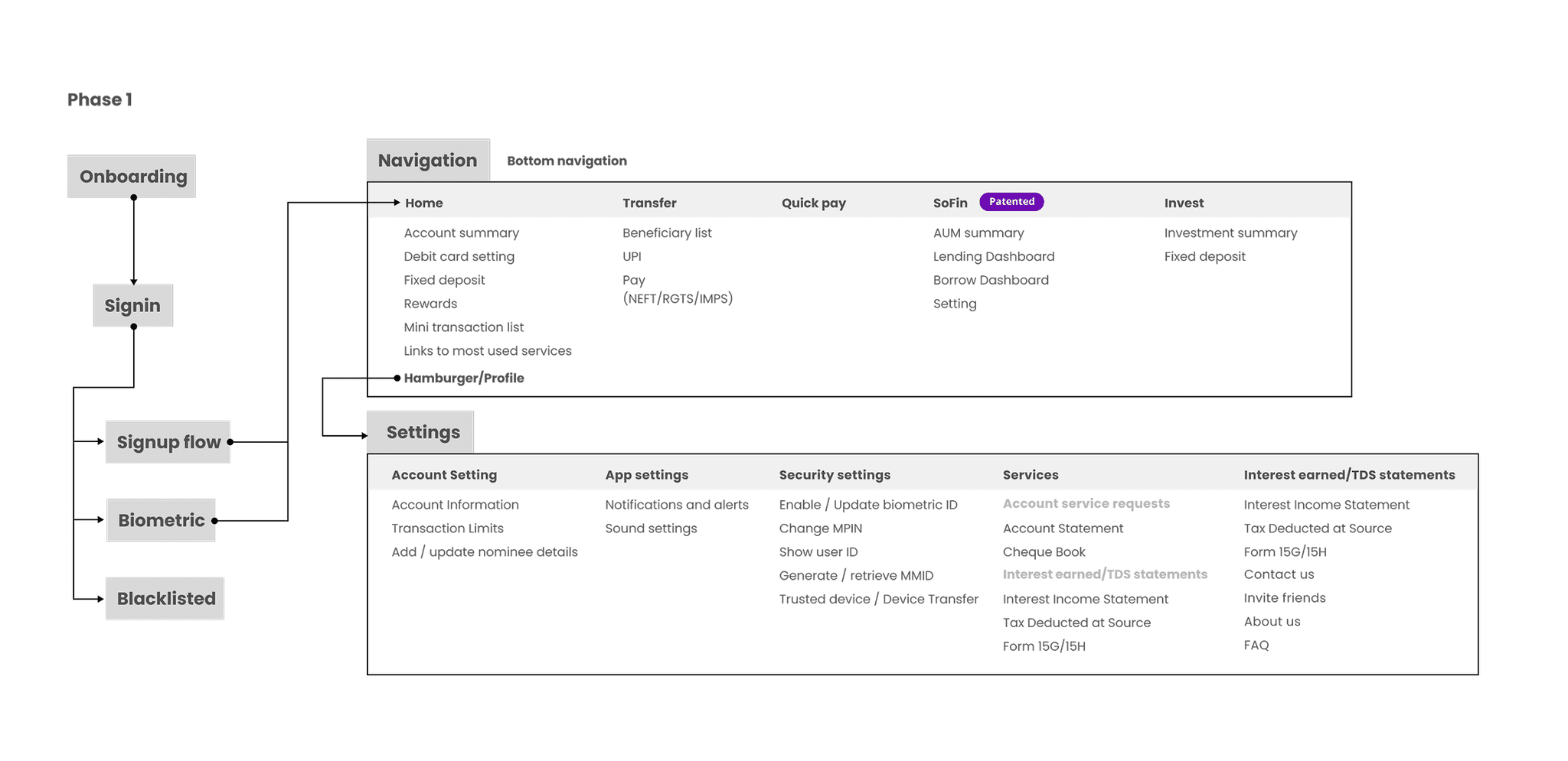
- Information architecture — including the dual-state navigation model
- Home screen, fixed-deposit, and core transaction UX and UI
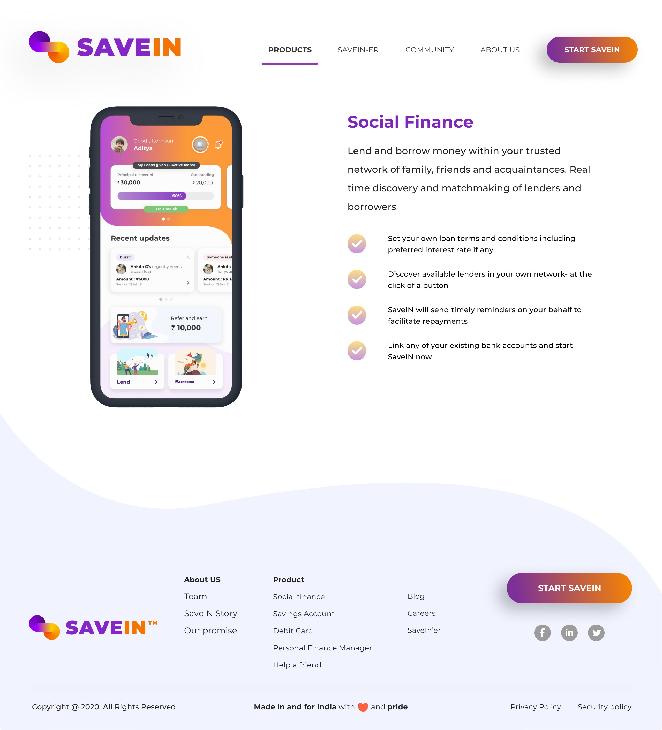
- Developed the client’s early P2P lending idea into a fully designed social-finance feature (NDA)
- Motion design and the app’s interaction feel
- Product direction and feature prioritisation, in co-creation with the client’s banking team
- Regulatory and compliance framing of flows (KYC, UPI, FD creation)
Solo design team. Tools: Figma, Google Workspace, sketching.
A full brand and product system delivered solo — identity, debit cards, information architecture, and core flows. Streamlined core flows were validated in the client’s usability testing as reducing user cognitive load.
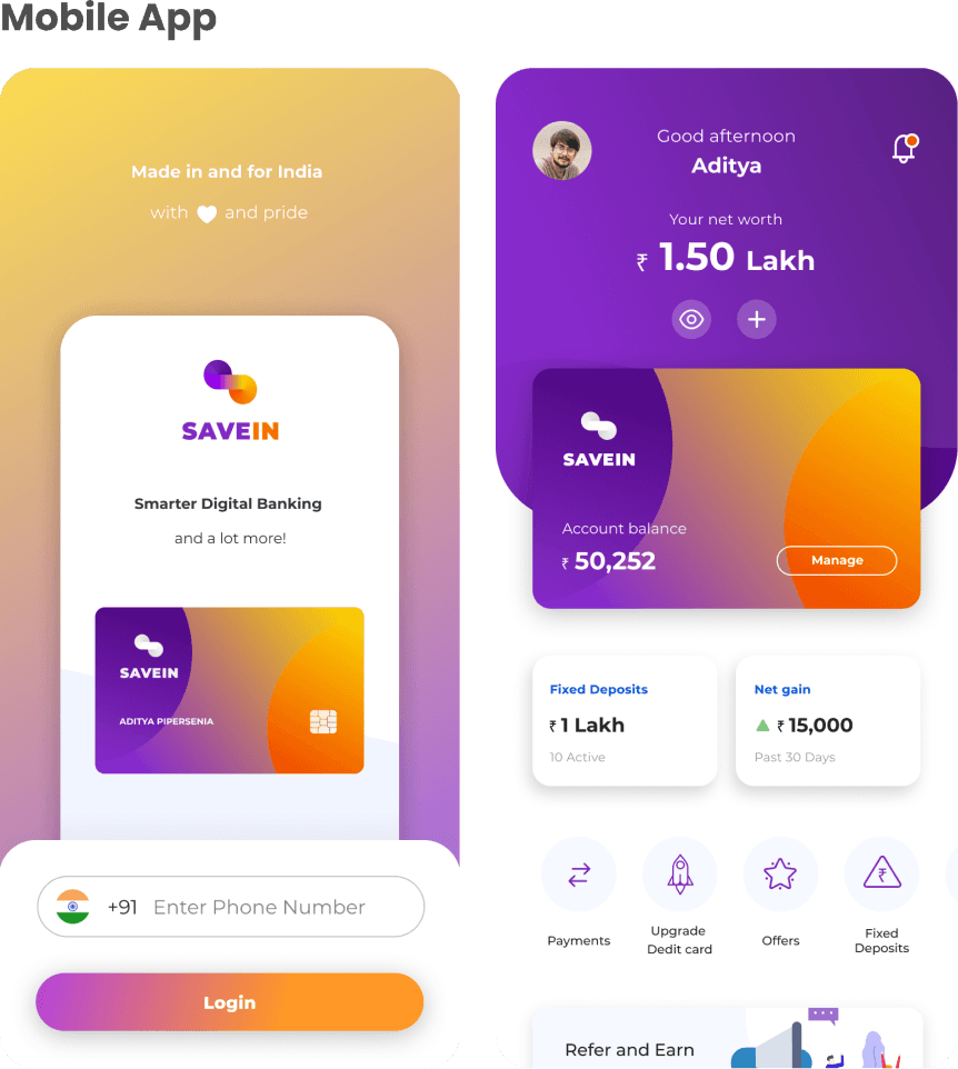
The sharpest call was changing what the app made people feel. Most banking apps make money feel stashed away — stored, static, out of sight. SaveIN gave everyday users the experience of having a wealth manager: net worth first, what’s liquid, what’s invested, and how much it has grown.
How SaveIN got made — brand, product, and what changed
India’s money habits were shifting fast. In 2019, non-card mobile payments surged 163% to $286 billion, and Demat account openings jumped 22.5% in a single year as retail investors arrived in force. Traditional banks couldn’t keep pace — their apps were inconsistent, slow to adopt new technology, and awkward to navigate.
Additionally, 75% of Indian adults don’t adequately understand basic financial concepts — which keeps them from investing at all. Building a faster app was the easy part. The real challenge was making money legible to increase confidence in people for investing.
The work moved through a Discover → Define → Develop → Deliver arc, but the discipline was resisting feature bloat — every screen had to earn its place against how Indian users actually behave with money.
Discover — Auditing what already frustrated users
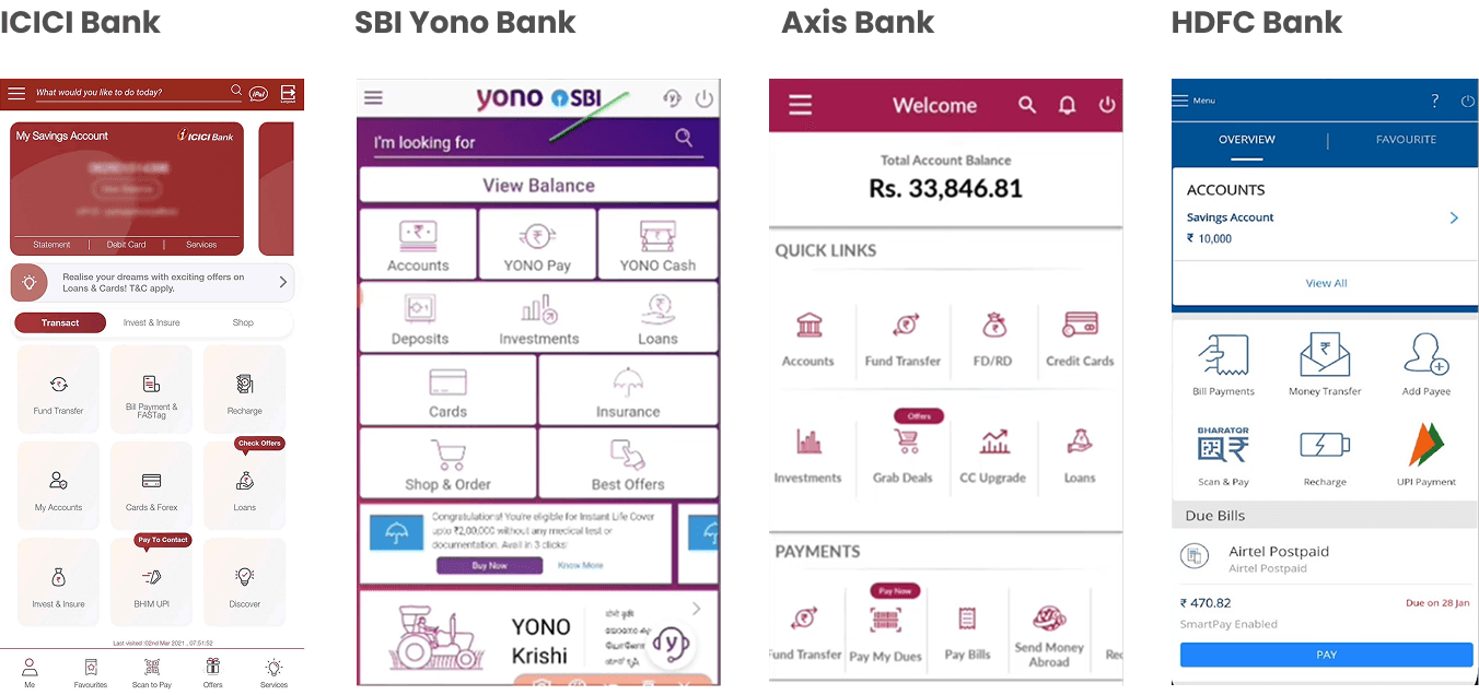
Five major banking apps — ICICI, SBI YONO, Axis, HDFC — were pulled apart screen by screen. The comparison exposed inconsistent experiences and slow fund-transfer flows at a moment when Paytm, PhonePe, and Google Pay had already reset user expectations.
The gap was that habitual, everyday money tasks had never been designed to feel fast within traditional banking apps.
Define
Pain points clustered into four opportunities: leverage the familiarity of social and payment apps, encourage mobile-payment adoption, demystify investing, and support lightweight budgeting. The through-line: everyday tasks and high-value decisions demand fundamentally different interfaces.
Stopped designing one banking app and started designing two states inside it — quick versus deep.
Develop
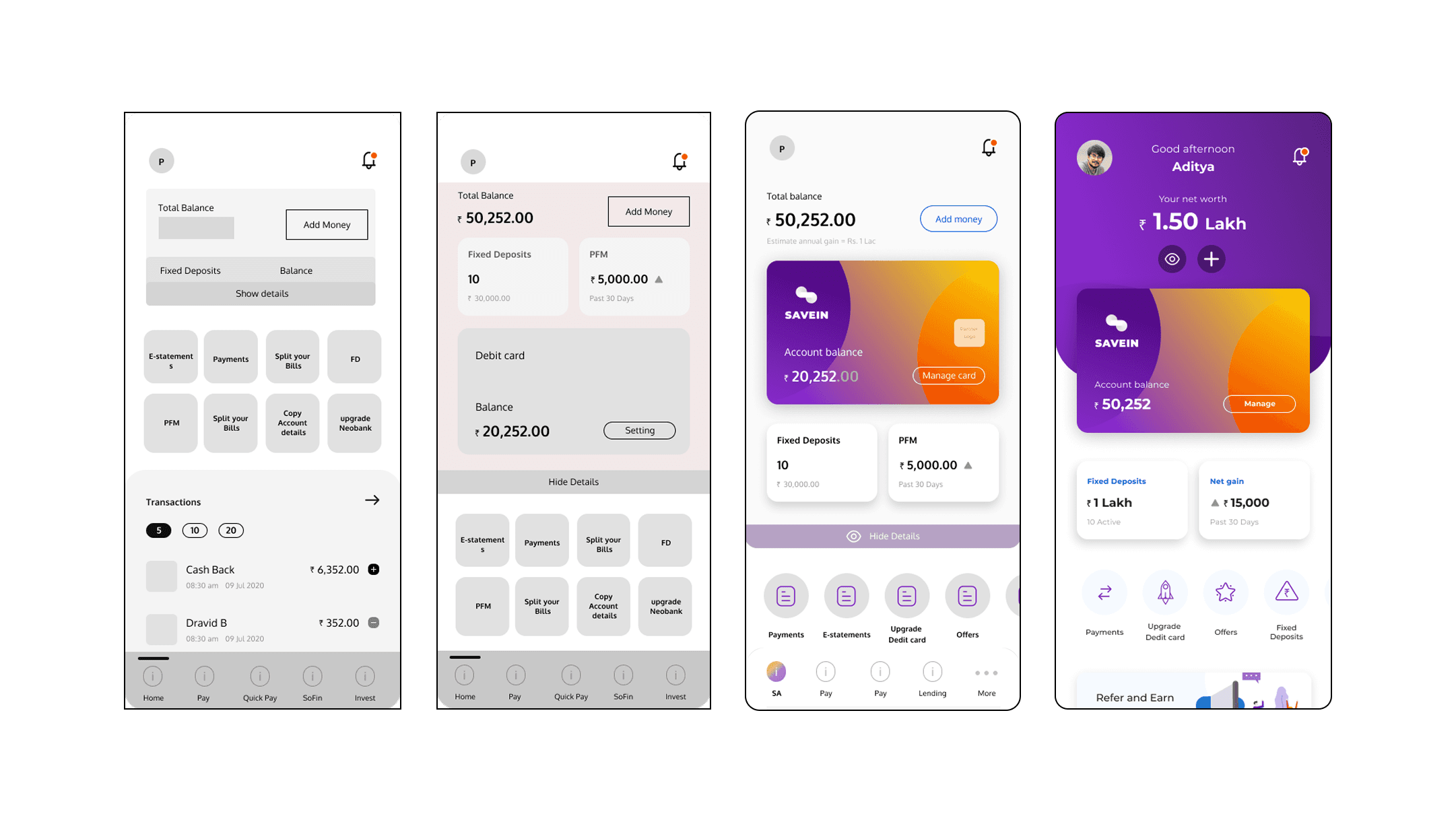
Inside the two-state architecture, legibility came from changing what each screen says. A screen that once led with a raw balance now opens like a wealth manager would: net worth first, then what’s liquid, what’s invested, and how much it has grown. Every core flow mapped onto the familiar sequence of physical banking. The app read as something users already knew how to move through.
Cognitive load dropped by mapping each flow to the rituals of physical banking — familiarity and simplification made the numbers legible.
Deliver — Making finance feel legible
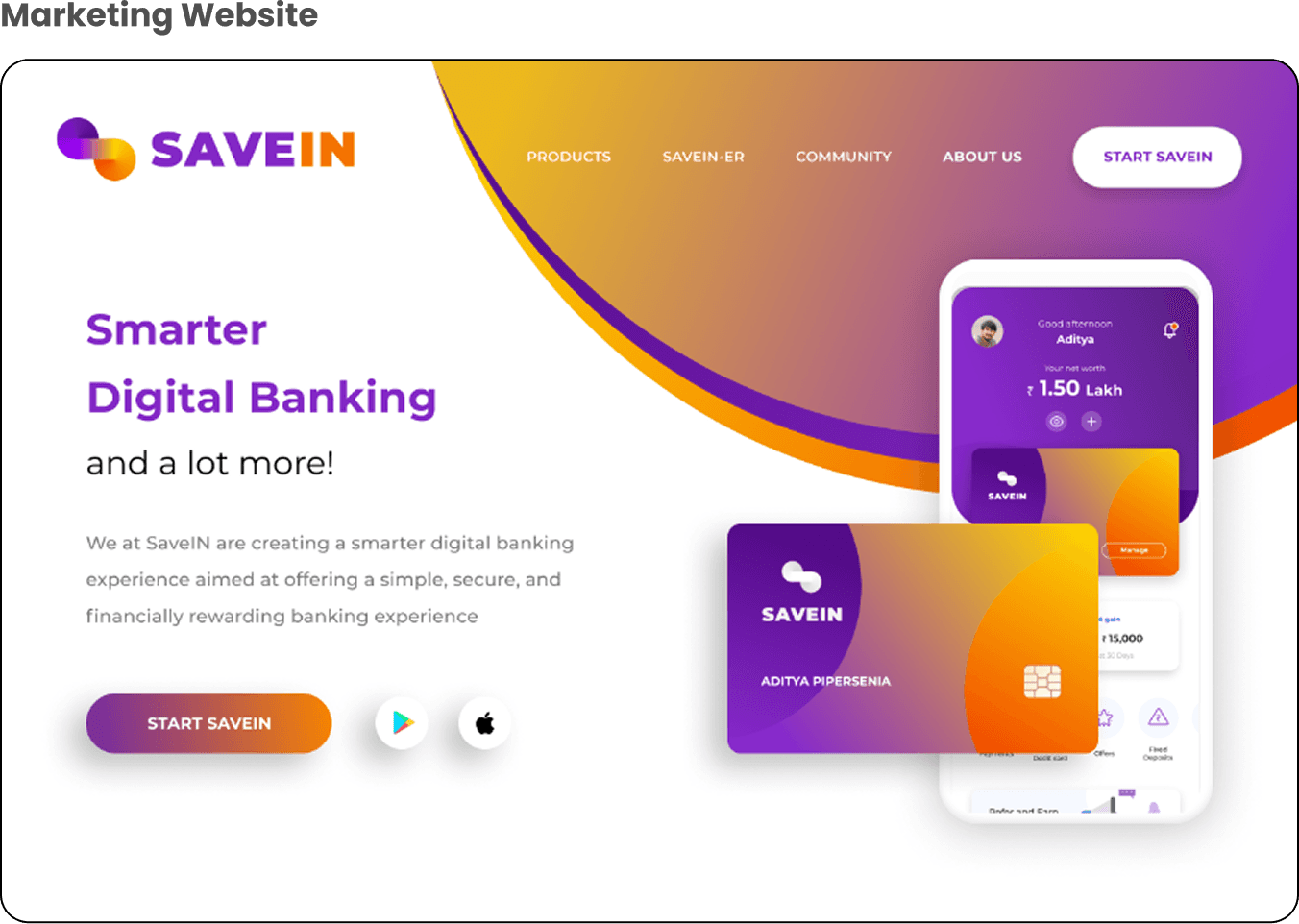
Delivery meant the whole system, built solo: brand identity and logo, the marketing website, the debit-card range, a rewards programme, peer-to-peer lending (under NDA), fixed deposits, payment transfers, and the gamified flows that tie them together — all assembled into a click-through prototype. Testing of these flows was run by the client’s own team.
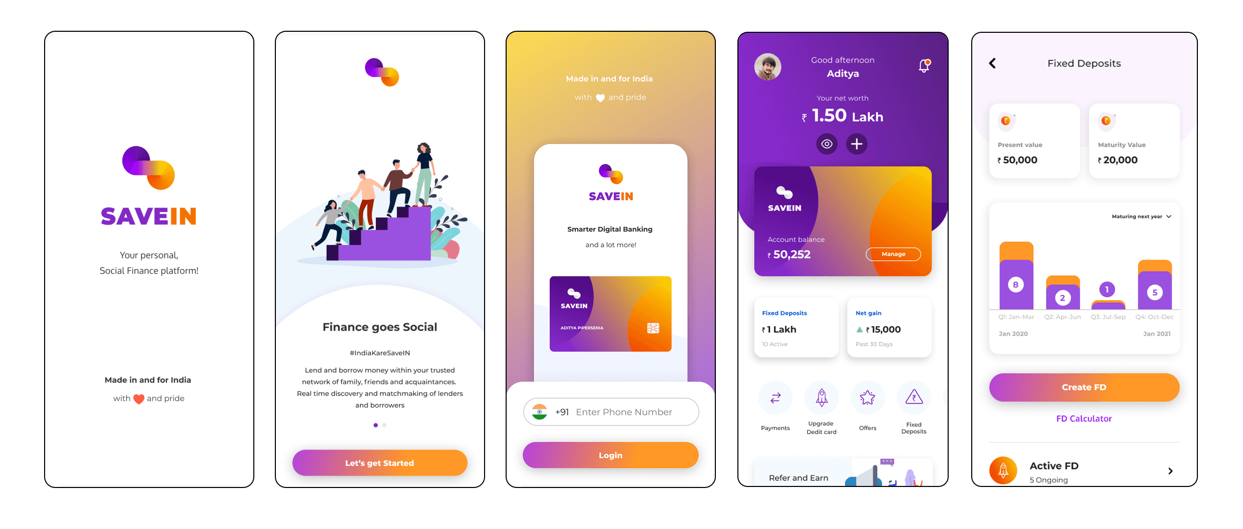
SaveIN is a mobile-first neo-bank for Indian millennials. The home screen leads with net worth, available balance, and investment growth at a glance — built for quick comprehension and quick action. The gradient-rich identity, anchored in the ‘S’ and infinity mark, signals optimism, security, and clarity across every touchpoint from card to app.
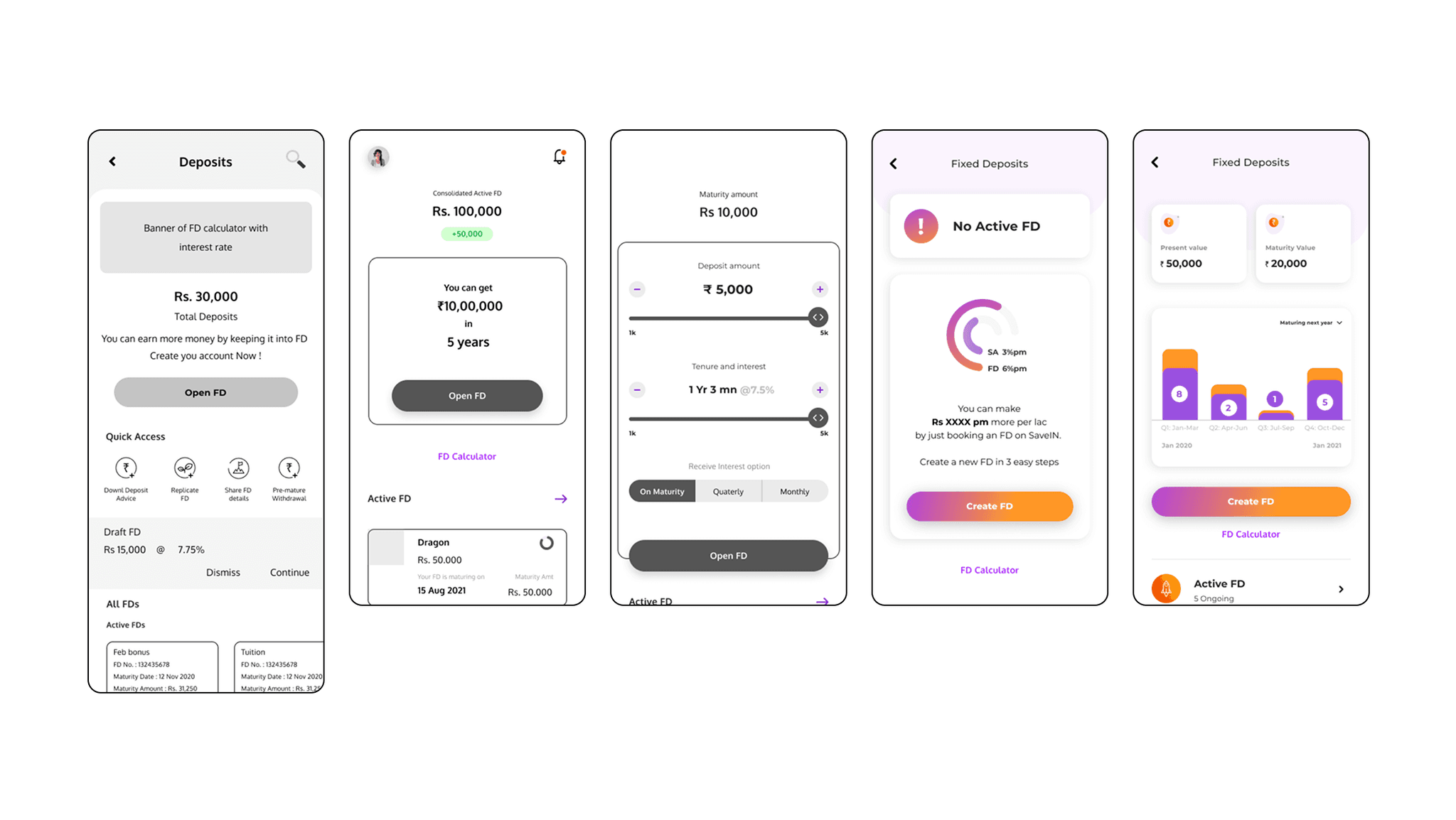
Fixed Deposits — Driving Deeper Engagement
The goal was to shift FDs from a static, backend feature to a front-and-center financial tool — one users could trust, understand, and feel good about using regularly. Through multiple dashboard iterations, I focused on:
- Showing clear growth projections (present vs maturity value)
- Making interest and returns instantly understandable
- Using visual cues like charts and timelines to reduce abstraction
- Simplifying the FD creation flow into 3 quick steps
- Adding gamified nudges (like “You can make ₹X per lac”) to increase actionability
SaveIN reframed digital banking from a compliance chore into something that felt like progress — separating everyday speed from high-value depth, and making financial data legible enough to trust. The sharpest lesson for me was that solo design is systems thinking: owning branding, UX, motion, and service design at once forced clear trade-offs, and taught me that in fintech, clarity is the product — every typographic and layout choice was ultimately a decision about trust.
Designing within regulation is a creative constraint
Banking experiences are shaped by regulatory frameworks as much as by user needs. Working inside RBI and compliance guidelines — simplifying KYC, UPI, and FD creation without losing clarity or delight — turned constraint into a design brief rather than an obstacle.
Trust is built with transparency
In fintech, trust is everything. Making financial data — interest rates, net worth, maturity value — immediately understandable drove every choice from typography to card layouts, all aimed at reducing ambiguity.
Solo design requires systems thinking
As a one-person team, the work spanned branding, UX, visual systems, motion, and service design at once. That breadth sharpened the ability to make trade-offs and prioritise the features that mattered most.