STITCH: Helping Production Planners Switch Without Starting Over
A production-planning dashboard for garment manufacturers that preserved the workflow operators already understood — while making it simpler for factories to move off an expensive industry standard.
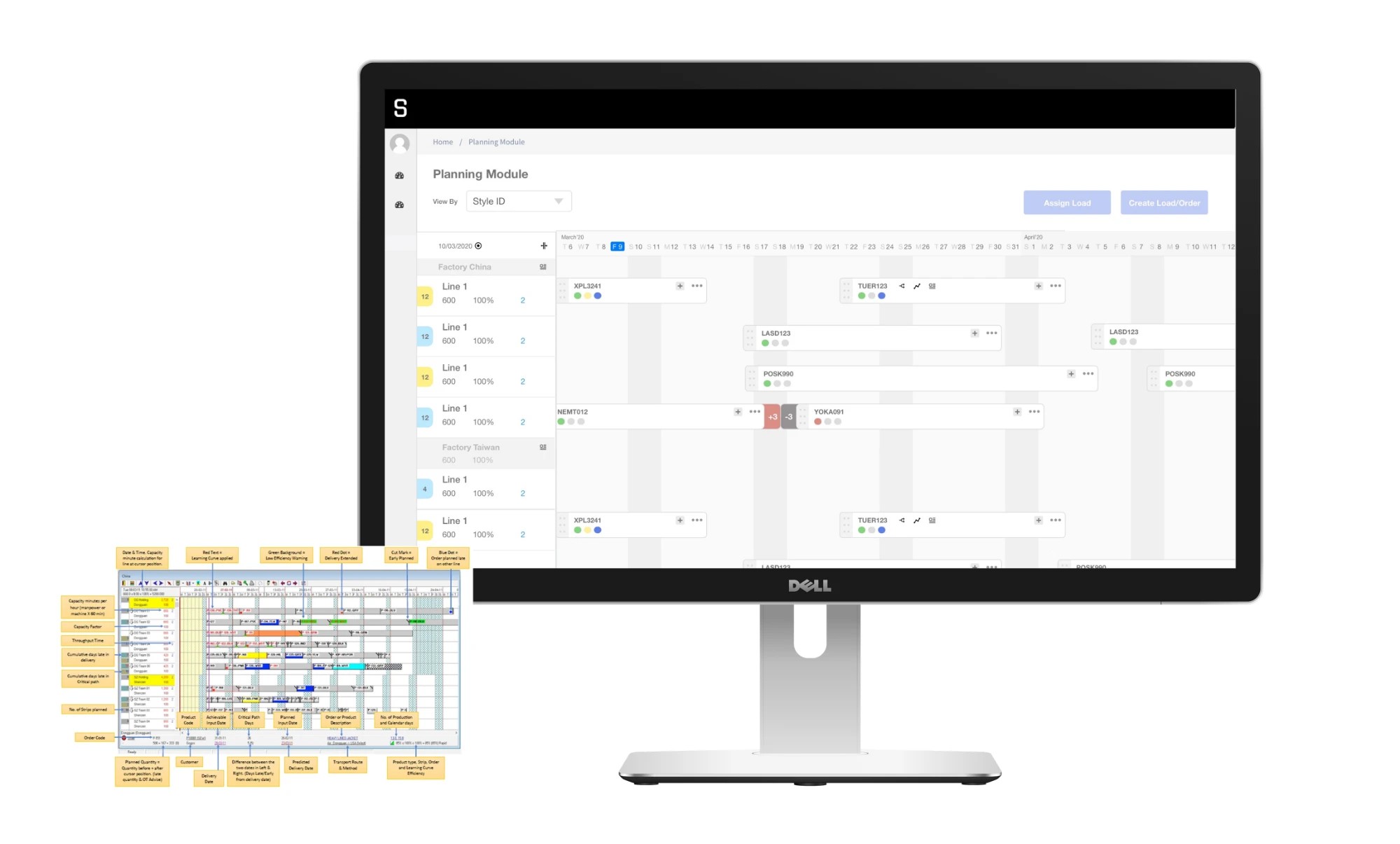
Design a planning dashboard that matched Fast React’s capability while lowering the barrier to switching — without forcing planners to relearn how they work.
- Build a scalable Industry 4.0 SaaS platform for production planning
- Translate an established legacy workflow into a modern digital product
- Support adoption across manufacturing clients without disrupting existing operations
- Demonstrate clear commercial value to prospective clients
- Retain the familiar planning logic and mental model of Fast React
- Move between legacy and new systems with minimal cognitive switching
- See production states, priorities and dependencies clearly
- Plan and adjust manufacturing schedules without relearning core workflows
Studied the Fast React board and the conventions planners already relied on, then preserved its mental model — timeline, terminology, colour-coded states — while cutting visual density, duplication and navigation.
- Studying the Fast React planning board screen by screen
- Identifying the conventions operators already understood
- Defining the information hierarchy and overview-to-detail structure
- Designing the planning dashboard and detailed style / line / factory views
- Designing the assign-load and create-load flows on the timeline
- Creating the final user interface
- Gathering product and workflow requirements with the client’s team
- Prioritising which Fast React capabilities STITCH needed to match
Sole designer, in collaboration with STITCH by Auriga. Tools: Figma, sketching.
A planning dashboard that competed with the industry standard at lower cost and a shorter learning curve — with familiarity built into the adoption strategy, so moving to STITCH felt low-risk.
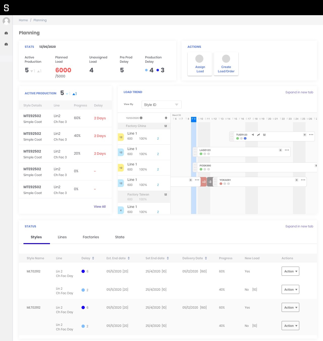
I didn’t rebuild the whole workflow. I kept the few patterns planners actually rely on, and built one board that worked for the clients, the founders, and the dev team.
How STITCH got built — keeping what planners knew, simplifying the rest
STITCH is a manufacturing execution system built for apparel factories — it helps manufacturers spot production losses, coordinate planning and gain visibility across the production supply chain. To compete for larger manufacturers, it needed a planning board comparable to Fast React, the established tool already used across the industry.
The difficulty wasn’t only matching features. Production planners had spent years learning Fast React’s dense interface, terminology and colour-coded system. Switching platforms could mean retraining an entire team, disrupting operations and raising the perceived risk of adopting STITCH.
The planning board wasn’t a standalone dashboard — it connected the full journey from reading production health to putting a new order onto a factory line. The work moved from understanding the existing system, to a reframe, to structuring the experience around the decisions a planner repeatedly makes.
Understand — how planners already read Fast React
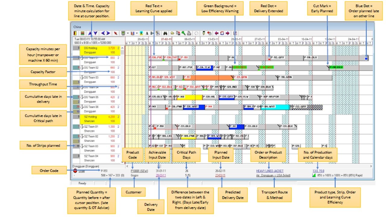
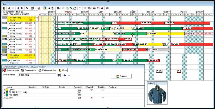
Fast React used a dense, Gantt-style board connecting production orders, factory lines, capacity, delivery dates and problem states. Operators leaned on familiar signals — work in progress, slightly late and severely delayed orders, critical paths, available capacity, planned vs actual delivery. The board was overwhelming to look at, but its structure mirrored how planners already understood production.
The interface was hard to read — but its mental model was already embedded in operators’ daily work.
Reframe — familiarity vs simplification
STITCH had three people pulling in different directions. The clients wanted a board that felt familiar. The founders wanted to copy the old planning board closely and ship fast. The product team wanted it to fit the design system they’d already built.
I didn’t keep the whole workflow. I pulled out the few patterns planners actually rely on and built the board around those. Clients kept the familiarity they trust, founders got a product that looked modern instead of archaic, and the team got a design that slots into their system instead of fighting it. Now everyone knew what to change and what to leave alone.
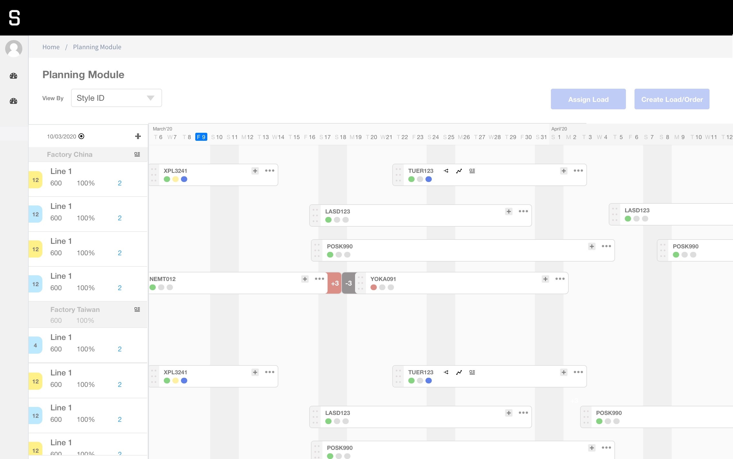
The Fast React interface is a monolith that mimics Microsoft-style menus and shortcuts; planners’ mental models are built largely from its main workflows and the visual language the software sets. I mapped what had to stay familiar for planners to work confidently from day one — and what could be simplified without changing how they make decisions. That produced two principles: preserve familiarity (the timeline, the relationships between styles, factories and lines, terminology, colour-coded states, the workflow sequence) and reduce complexity (visual density, navigation, duplication, and the overview-to-detail hierarchy).
Preserve the planning logic operators already trust; simplify everything around it.
Deliver — a cleaner planning system
The redesigned experience surfaced an operational planning overview, load and production trends, a timeline-based planning board, style-level information, factory and production-line views, visible delay and capacity states, and direct access to planning actions — preserving the planning logic operators understood while presenting it through a cleaner, more structured interface.
Two flows run through the same time-based model: plan & assign (see production health → diagnose by style, line or factory → select an unassigned load → compare line capacity → place it on the timeline → confirm) and create a load (order details → production plan → milestones → learning curve → ready for assignment).
The redesigned planning experience presents production health, capacity and delays up front, then lets planners diagnose by style, line or factory before acting. The familiar Gantt-style timeline is preserved so operators can reason spatially about factory, line, load and time.
Create-load — turning an order into a schedule
Creating a new load connects order information with the production process. Each step turns order data into something schedulable:
- Quantities and variants become a production plan
- Milestones — fabric in-house, cutting, sewing, finishing — become a timeline
- Expected line efficiency becomes a learning curve
- Each load shows its expected production duration before it’s placed and confirmed
STITCH gained a planning dashboard that could credibly compete with the established industry platform while offering a simpler, lower-cost alternative. It didn’t require operators to abandon their existing mental model — familiarity became part of the adoption strategy, reducing the perceived disruption of moving to a new system.
Familiarity can be a feature
Innovation in enterprise software doesn’t always mean inventing a new interaction model. In specialist environments, familiarity preserves expertise, reduces adoption risk, and makes a new product easier to trust.
Design for the expert, not the demo
Experienced planners move fast because the interface matches how they already think. A more modern-looking redesign might demo better and slow them down in daily use.
The strongest decision was what not to change
The sharpest call wasn’t what I changed — it was recognising what operators couldn’t afford to relearn, and protecting it.